Fintable · Brand
FintableA florin, whose crossbar is a table.
Everything you need to put Fintable in a story, a deck, a partner page or a marketplace listing. Take what you need — no permission required, provided it is not altered.
Where the name comes from
In 1252 the city of Florence began striking a small gold coin. It carried the city’s lily on one face and John the Baptist on the other, and it held about three and a half grams of gold — the same weight, struck to the same standard, every time. That reliability was the whole point. Merchants across Europe could accept it without weighing it or arguing about it, and for the better part of two centuries the fiorino d’oro was the closest thing the continent had to a common currency.
Other cities copied it, and the name travelled with the coin. It became the florin in England, the florijn in the Low Countries, the forint in Hungary — where it is still the currency today. And it left behind a symbol: ƒ, the florin sign, which stood on Dutch price tags until the euro arrived and is still the currency mark of the Aruban florin.
The ƒ was never a logo or a piece of signage; it was a bookkeeping mark. Dutch and Flemish merchants wrote it in the money column of their account books, and the habit outlived the coin — when the guilder became the currency of the Netherlands the ƒ went with it, standing in front of every price and every balance right up to the euro changeover in 2002.
The timing is not a coincidence either. Double-entry bookkeeping was taking shape in the same Italian merchant cities in the same period, and the earliest surviving double-entry ledgers were written by Florentine and Genoese houses within a few decades of the first florins. The coin and the account book grew up together. For most of the seven centuries since, this symbol has meant one specific thing: a number in a column of accounts. The whole story is on our blog.
The app icon · one of the primary marks
A florin was a unit everyone could trust without checking — a number that meant the same thing to both parties. The symbol carries that history wherever it goes; on a home screen, a browser tab or a marketplace listing it travels as the icon on the left.
It also happens to be a shape that will not sit still. Every one of these readings is true at once, and none of them had to be added:
- ƒ a currency The florin sign — the coin above, and still the currency mark of the Aruban florin.
- ƒ a function Johann Bernoulli was writing ƒx by 1718 and Euler settled on f(x) in 1734. It is why the short lockup reads Fn in developer contexts.
- ƒ a bookkeeping mark Its oldest job, and older than the mathematics: the symbol clerks wrote in the money column of a ledger.
- F a letter The first letter of the name, which is what lets the symbol stand alone as an avatar or a tile.
- Fin a syllable The first half of Fintable. The crossbar supplies the second.
- A header rule The horizontal the letter needs anyway, run full width — with two shorter rows beneath it. A table.
- Rows of unequal length Which is what makes them read as data rather than as decoration.
Files
PNG for screens and documents; SVG for the symbol wherever it needs to scale without limit. Each one downloads on click.
Square PNGs · 512 or 1024 px
Choose a transparent symbol to place on your own background, or a solid-background version with the colour included in the PNG. The app icon keeps its transparent corners.

Product screenshots
The canonical shots. Use these rather than taking your own — they are framed at standard sizes and every figure in them is invented, so nothing here belongs to a real Fintable customer.
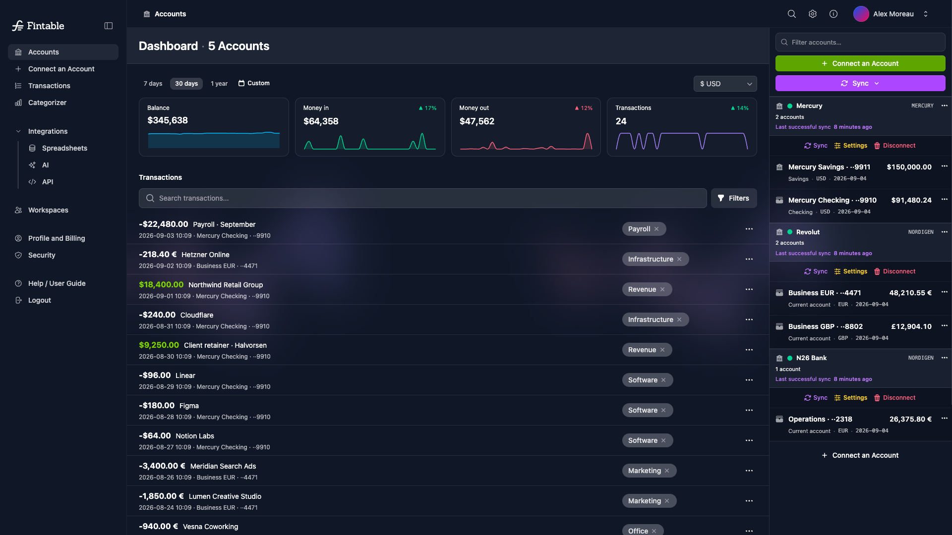
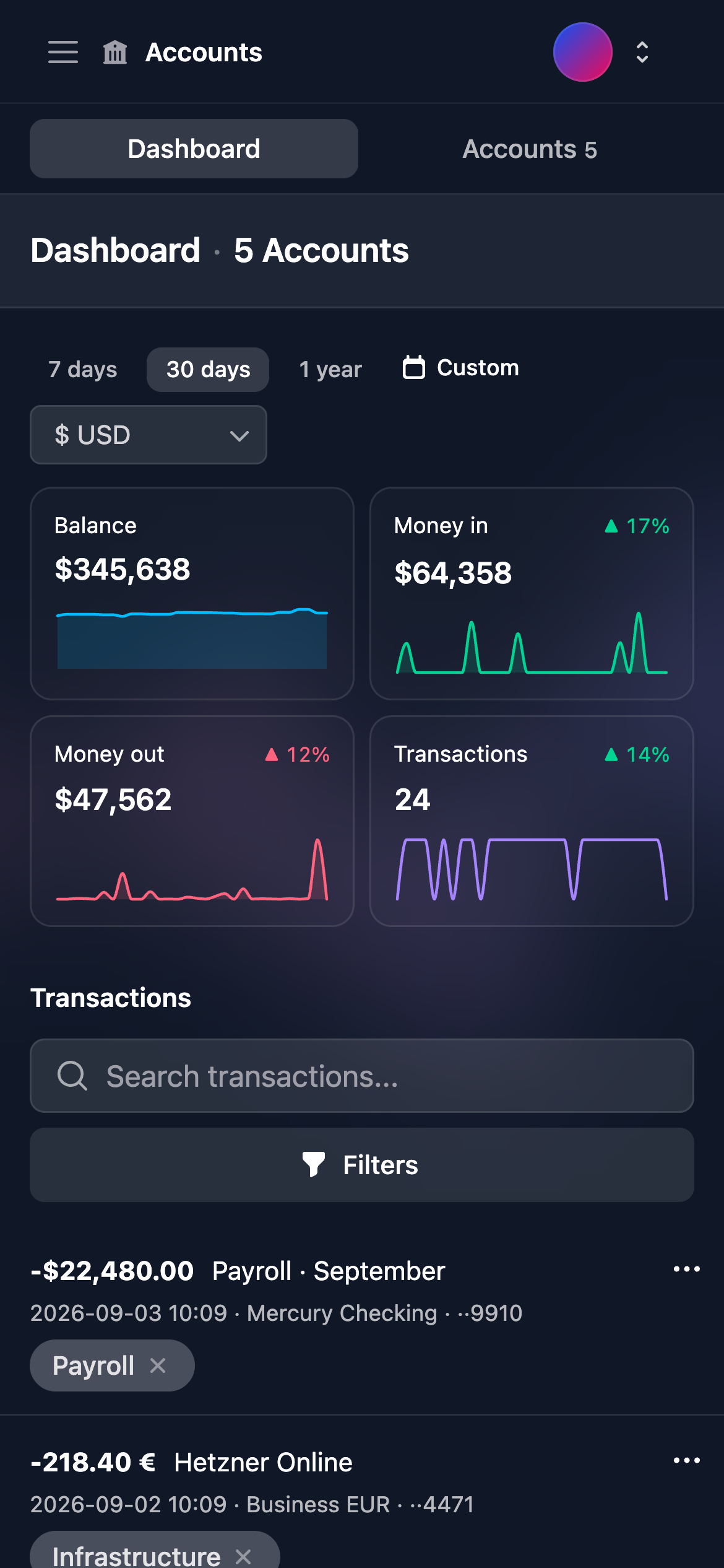
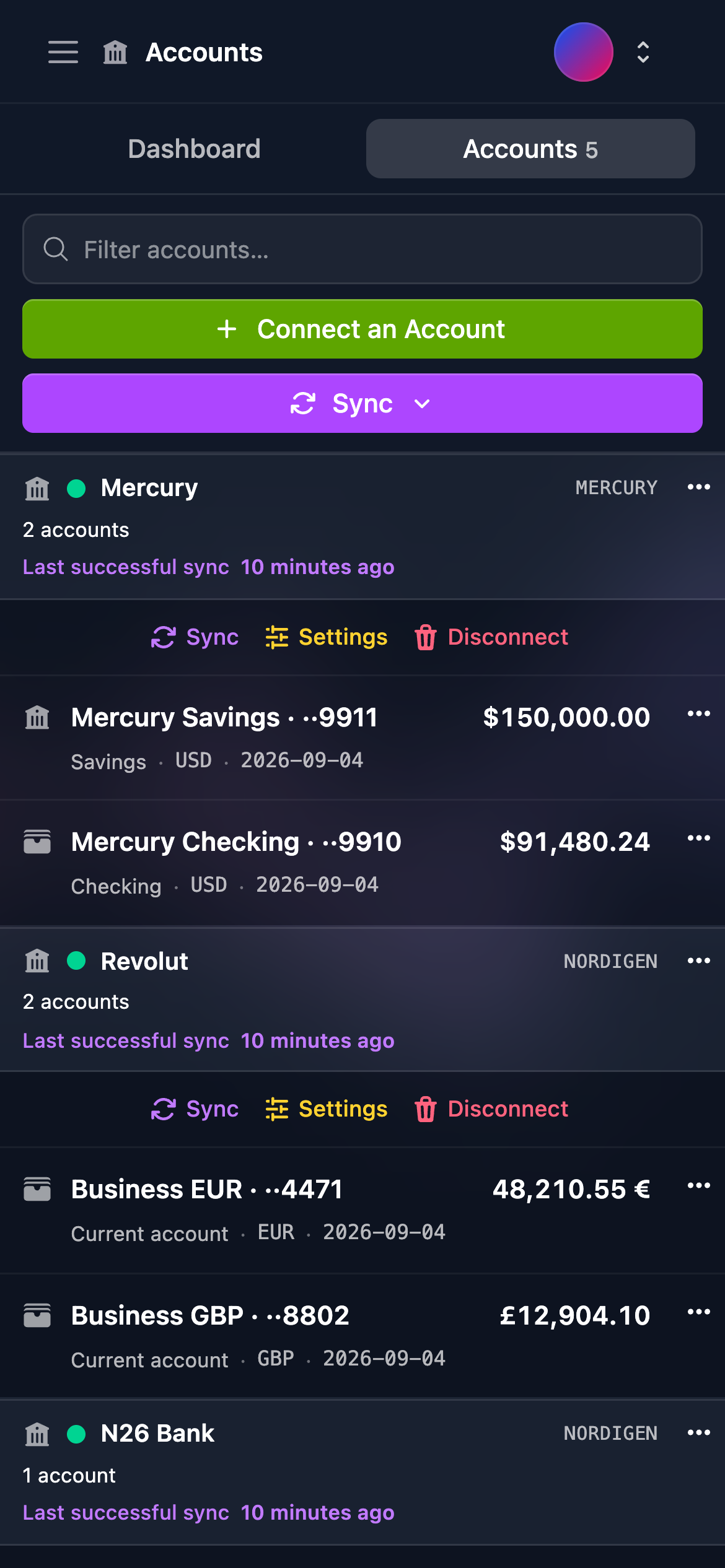
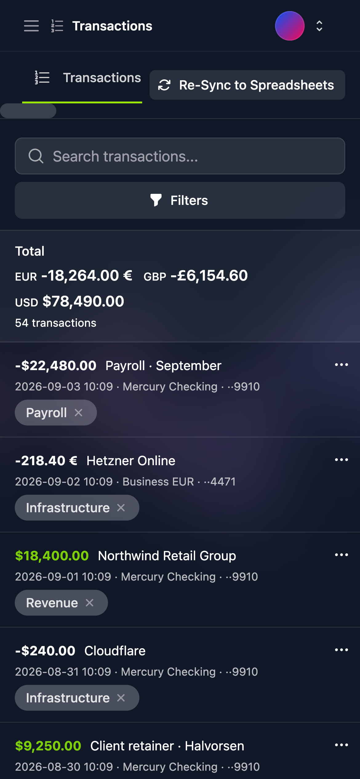



The symbol
The mark is that florin sign, ƒ, with one adjustment. The letter already needs a horizontal stroke through its stem, so we ran it the full width and gave it two shorter lines beneath — and it became a table: a header rule with rows under it.
Fin and table, in a single letter. The money and the spreadsheet, in the same stroke.
Colour
The logo has one colour pairing and no others: white on the dark ink, or the dark ink on white. There is no coloured version to choose between — whichever background you are placing it on decides which one you use. (The product interface has its own accent and status colours; none of them ever touch the logo.)
The one exception is the app icon, which is lit. It carries a gradient through three shades of the same ink, a soft gloss and a rim of light, so that it reads as an object rather than a black square at the small sizes app stores, home screens and directories render it at. All of that belongs to the icon and nowhere else: the logo itself is always flat.
The name
Written Fintable — one word, capital F, never all caps and never split. It is set in Sanchez, a slab serif with the squared-off feel of printed ledgers and share certificates, which is the company the florin keeps.
Giving it room
Leave clear space around the logo of at least the width of the symbol itself, on every side. Nothing else sits inside that space. Below roughly the smallest size shown here the word closes up — use the symbol on its own instead.
The short lockup: Fn
There is one abbreviated lockup, and it reads Fn. The symbol is a ƒ — which is also the mathematical mark for a function, the f(x) Euler introduced in 1734. So in an API reference, an SDK readme or a developer console, Fn is less a truncation of the name than a second reading of the symbol that happens to be true.
Use it in developer and API contexts, and where a directory or partner listing hands you a slot the full logo will not fit — a frame only a couple of times wider than it is tall. Everywhere else use the full logo; and if even this will not fit, use the symbol on its own.
Please don’t
Use the files as they come. If a placement seems to need something not covered here, write to us rather than adapting the logo yourself — we will make you the version you need.
Let the background decide: white on dark, ink on light.
There is no coloured version. The green logo is retired.
Not in another typeface, not in bold, not in capitals. Fn is the one sanctioned abbreviation — see above. There is no Fin, FT or bare F.
No circles, badges or outlines. The app icon is the only container.
Scale it evenly. Never squash, rotate or slant it further.
The symbol and the name keep the spacing they arrive with.